![]()
Bring Life to Your Living Space
![]()
Bring Life to Your Living Space

There’s a particular kind of frustration that comes with moving into a townhouse. You’ve got the square footage – maybe 1,400, maybe 1,800 square feet – and yet every room feels like it’s fighting you. The hallway swallows furniture. The living room is long and narrow, like a bowling lane with a sofa dropped in the middle. The staircase lands in the most inconvenient possible position. Natural light hits the front and back but somehow misses everywhere in between.
I’ve styled dozens of townhouses over the past decade, and I’ll tell you something that surprises most new owners: the townhouse layout is genuinely one of the best formats to work with. Vertically stacked living means you can create distinct, intentional spaces at every level. Narrow rooms force you to be disciplined with furniture – which almost always leads to better results than sprawling floor plans where people try to fill every inch. The constraints are the design. For more affordable decorating inspiration tailored to real layouts and smaller footprints, visit our main decorating hub.
The problem isn’t the townhouse. It’s styling it like a wide, single-story home when it’s fundamentally something different. This guide is about learning to work with what you have – and getting genuinely good results from it.
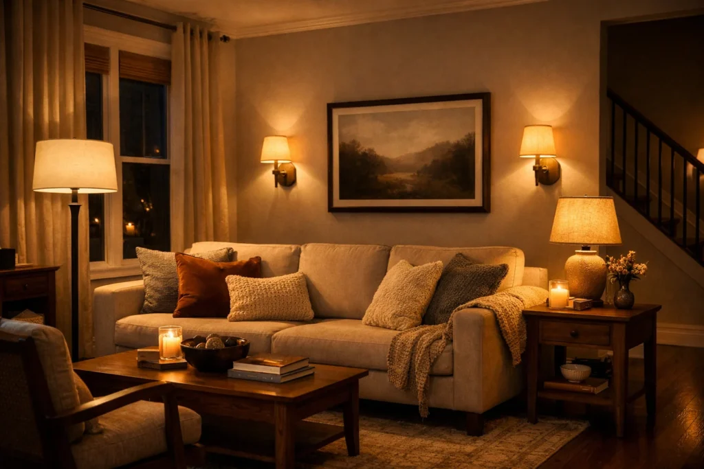
The most common mistake in a narrow living room is pushing all the furniture against the walls. It feels logical – create more floor space in the middle – but it actually makes the room feel smaller and disconnected. Furniture needs breathing room from walls to feel intentional rather than shoved aside.
In a room that’s roughly 10–12 feet wide (which is typical for townhouse living rooms), you want a sofa that’s no more than 84 inches wide. A standard 90-inch three-seater is often the culprit behind a room that feels cramped. Pull it 4–6 inches from the wall. Place a slim console or a shallow oak shelving unit behind the sofa – this technique anchors the space and gives you storage without using floor area. If you’re unfamiliar with the styling logic behind this placement, understanding behind couch decorating ideas can help you style the space between your sofa and wall in a way that feels intentional rather than cluttered.
Keep the coffee table proportional. A rectangular table that’s roughly two-thirds the length of your sofa works well in narrow spaces. Round tables actually read wider than they are because they don’t create a strong linear axis down the room – useful if your room already feels like a corridor.
Many townhouses have a ground floor that combines kitchen, dining, and living in one run of space. Without walls, you need to create zones through materiality and placement rather than architecture.
A jute or wool rug under the sofa and coffee table immediately defines the living zone. In the dining area, a different rug – perhaps a flatweave cotton or a patterned woven – signals the boundary. The materials don’t need to match, but they should feel like they belong to the same palette.
Pendant lighting does the zoning work that walls would otherwise do. A pair of rattan or linen pendants over the dining table drops a visual ceiling in that zone, making it feel like a dedicated room even when it’s technically part of the same open plan. The kitchen area benefits from under-cabinet lighting that separates it further.
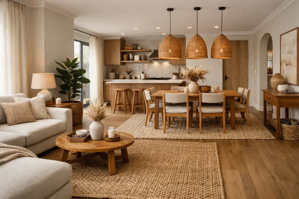
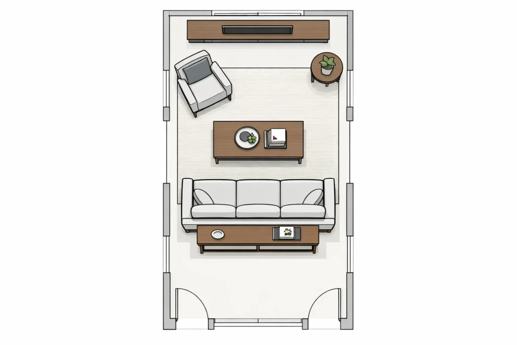
Long rooms – common in Victorian-era townhouses – need a break in the middle. Two distinct seating arrangements rather than one large one work far better than most people expect. A pair of armchairs with a small side table creates a reading corner at one end. The sofa anchors the other. A console table or low bookcase placed perpendicular to the wall at the midpoint creates a visual divider without closing off the space.
Think of it like staging a conversation: every seat should feel like it’s part of a circle, not a lineup.
Horizontal lines make rooms feel wider. This is why shiplap, horizontal board-and-batten, and wide-plank flooring running perpendicular to the room’s length all open up narrow spaces. If you’re choosing new flooring, dark hardwood floors with wide planks running across the width of the room is one of the highest-impact changes you can make – the grain lines pull the eye sideways, counteracting the tunnel effect of a long room. If you’re choosing flooring or working with existing wood, these dark hardwood floors decorating ideas will help you balance depth with light furniture and warm metals.
Mirrors are your most accessible tool. A large mirror on a side wall (not the end wall, which emphasizes length rather than width) reflects light and creates the illusion of a perpendicular room beyond. Size matters here – a mirror under 24 inches wide reads as décor; a mirror over 36 inches reads as architecture.
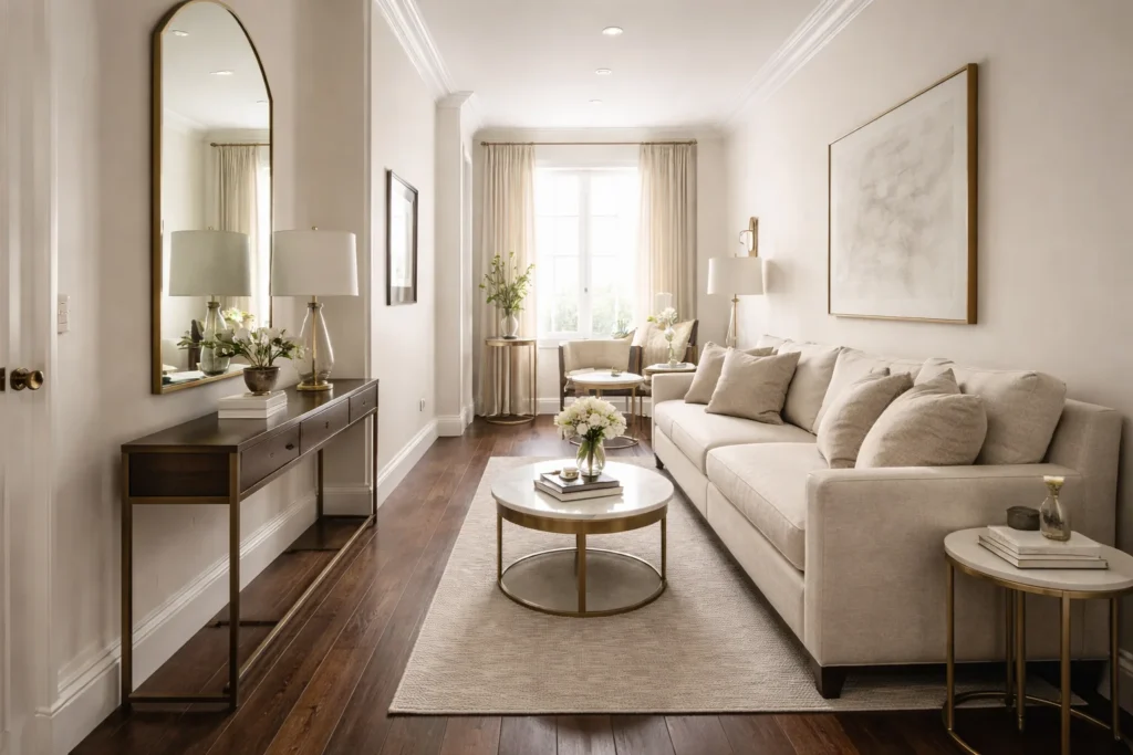
A rug that’s too small is one of the most persistent problems in townhouse living rooms. In a 10×14 room, you need at least an 8×10 rug. The front legs of all seating furniture should sit on the rug. A rug that only sits under the coffee table with furniture floating around it looks like an island rather than an anchor.
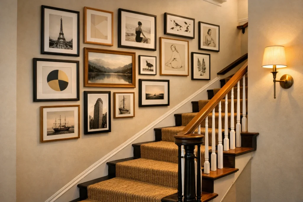
Staircases in townhouses are either a wasted opportunity or one of the best design features in the home – there’s rarely a middle ground. The wall alongside the stair is one of the most naturally prominent display surfaces you have, and most people either leave it blank or fill it haphazardly.
A well-curated gallery wall on the stair wall should feel like a slow reveal – each piece visible for a few steps, then something new comes into view. The sweet spot is frames between 5–18 inches for the smaller pieces, with one or two anchors at 24 inches or larger. Mix print photography with line-art illustrations and a small mirror or two. Keep frames in a consistent finish (matte black, natural oak, or brass-tipped) even if the artwork varies wildly. Seasonal styling can also elevate staircases subtle greenery inspired by garland decorating ideas adds softness without overwhelming narrow walls.
For the stairs themselves, a stair runner in a natural fiber – seagrass, sisal, or a striped wool – is both practical and handsome. It reduces noise considerably in a vertically stacked home, which is something most townhouse owners underestimate until they’re living with the clatter of footsteps on bare wood.
Landings are almost always awkward in townhouse decorating – they’re too small to be rooms, too significant to ignore. The goal is to give them a single, clear purpose rather than treating them as transition zones.
A small armchair with a floor lamp and a stack of books makes a landing feel like a study nook. A narrow console with a trailing plant, a scent diffuser, and one piece of framed art makes it feel like a considered pause. What doesn’t work is leaving it functionally empty with just a light fixture overhead – that reads as unfinished.
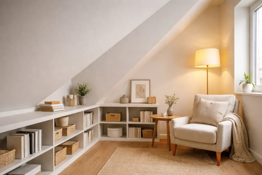
In townhouses with unusual ceiling configurations – slopes, dormers, or angled walls under the roof – the instinct is often to leave that space blank out of uncertainty. But slanted walls are genuinely interesting. Integrating built-in shelving or low-profile artwork into angled surfaces turns what feels like an architectural obstacle into a feature. If your upper level includes angled ceilings or dormers, these slanted wall decor ideas can help you turn awkward architecture into a design feature.
In a multi-level home, lighting does more work than in a flat plan. It connects floors visually, directs movement, and controls the perceived warmth of each level.
The ground floor typically gets the most natural light at the front and back but suffers in the middle. Supplement this with floor lamps placed in the darkest corners – not overhead fixtures, which flatten the space. Mid-floor levels (often where bedrooms sit in a three-storey townhouse) tend to feel dim and closed if only served by ceiling lights. Wall sconces on either side of a bed or desk, plus a warm-toned pendant in the hallway, correct this without requiring rewiring.
Stairwells benefit from pendant lights at the top that throw light downward, creating a clear visual path from floor to floor.
One of the things that separates a townhouse that feels curated from one that feels like a series of disconnected rooms is the thread of consistency between floors. This doesn’t mean every room needs the same color – it means the material palette should share some DNA.
If you’re using warm brass hardware in the kitchen, carry it to bathroom fittings and picture frame finishes upstairs. If you’ve introduced linen on the ground floor (curtains, cushion covers, lamp shades), bring it upward in a different form – a linen throw, linen roller blinds. The repetition of materials is what creates the sense that the whole home was styled by someone who knew what they were doing.
Designer Insight: The biggest single upgrade in a small living room isn’t a new sofa or a statement rug. It’s removing one or two pieces of furniture that shouldn’t be there. Edit first, add later.
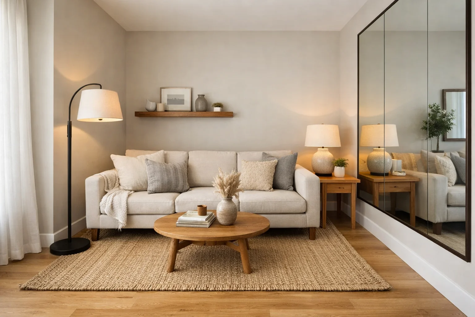
In a compact townhouse living room, slim profile furniture is everything. A sofa with exposed legs – tapered oak, powder-coated metal, or turned wood – lets light travel under it, which makes the room feel larger. A sofa that goes to the floor creates a visual block that stops the eye. The same principle applies to armchairs, coffee tables, and side tables.
Wall-mounted storage deserves serious consideration. A floating oak shelf above the sofa takes the place of a sideboard while freeing up floor area. Wall-mounted media units mean the TV isn’t sitting on a chunky cabinet that eats into the room’s usable depth. The floor-to-ceiling approach – running shelving all the way up rather than stopping at eye level – draws the eye upward and makes ceilings feel higher than they are.
Mirrors, as discussed, are workhorses. But placement matters. A mirror on the wall beside a window (perpendicular to the light source) bounces light across the room. A mirror opposite a window bounces it straight back, which can create glare. Use a large leaned mirror in a corner to make that corner recede visually – it’s a useful trick in rooms where the angles feel too tight.
For accent walls in small living rooms: the far short wall of a long room is the right choice. It draws the eye to the end of the room, extending the visual depth. The long walls should stay light. This is the opposite of what many people do intuitively, which is why small living room decorating ideas often hinge on understanding accent wall direction before choosing a color. If you’re working with especially tight dimensions, these small living room decorating ideas offer layout tricks that work exceptionally well in townhouse settings.
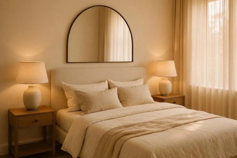
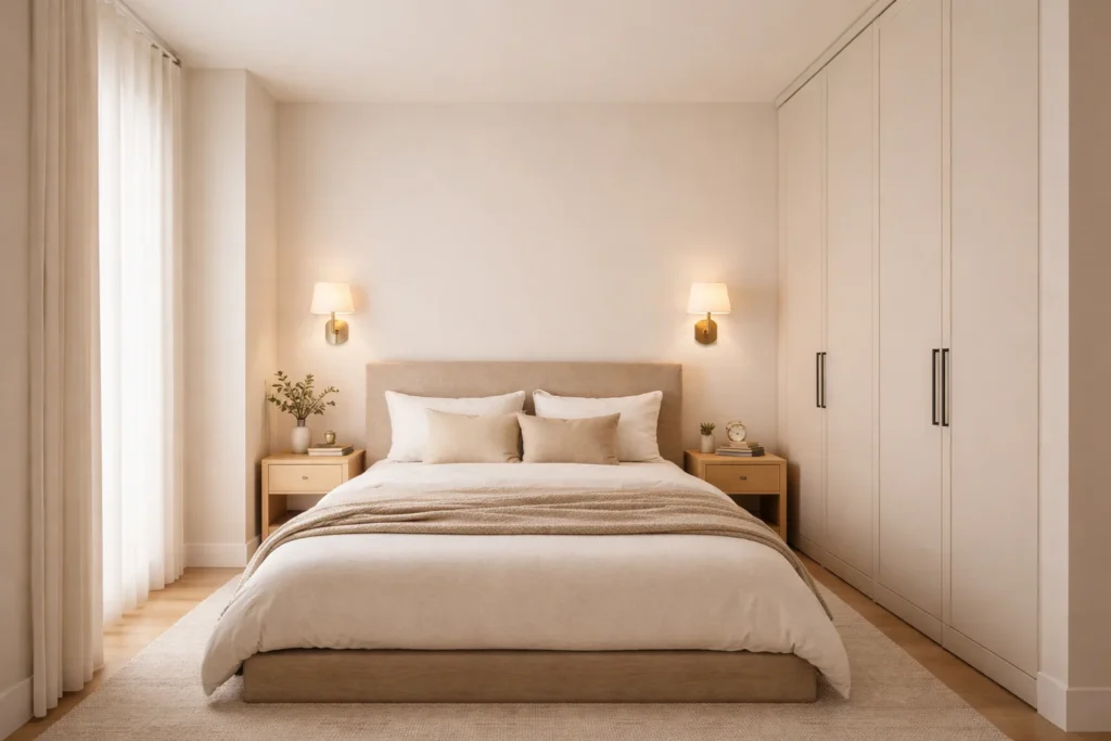
Bedrooms in townhouses are almost always smaller than the master bedrooms in detached homes – often 10×11 or 11×12 feet. That’s workable, but only if the bed is sized correctly and the room isn’t competing with itself.
A low-profile bed – either a platform bed or a simple divan base – keeps sight lines clear. Beds with tall headboards can work in rooms with high ceilings; in standard 8-foot ceiling townhouse bedrooms, they feel oppressive. Upholstered headboards in linen or bouclé are warm without being visually heavy – this is where a white wall bedroom decorating ideas approach works beautifully using texture and soft materials to warm up bright walls without overwhelming the space: the white amplifies light while the textured headboard provides warmth without mass.
For color: light doesn’t mean white. Warm off-whites (barely-there stone, aged linen, soft chalk) feel more restful than stark white and are far more flattering under artificial light. Cool whites with blue or grey undertones read as clinical in bedrooms and make small rooms feel even smaller.
Storage in townhouse bedrooms should go vertical. Wardrobes that run to the ceiling eliminate the dead space that collects dust at the top and makes rooms feel cluttered. Built-in wardrobes with simple, flat-front doors can be painted the same color as the wall – the effect is that the storage disappears into the room rather than announcing itself.
Under-bed storage is obvious but underused. Beds with integrated drawers on two sides are available at most price points and reclaim meaningful square footage when the alternative is struggling to fit a chest of drawers into the room.
Layered lighting in the bedroom is essential: a central ceiling fixture, bedside wall sconces or table lamps, and potentially a floor lamp in a corner. Relying on a single overhead light is the number one reason bedrooms feel institutional rather than restful.
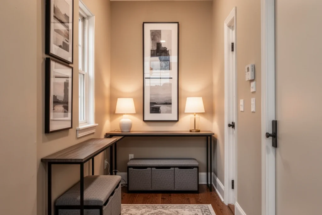
The entryway in a townhouse is often absurdly narrow – sometimes only 36–40 inches wide. The natural instinct is to treat it as purely functional. That’s a missed opportunity, because it’s the first impression of the entire home.
A narrow console table – anything under 14 inches deep – is the right starting point. If you’re unsure how to decorate tight transitional areas, exploring hallway and wall styling guides can help you layer light, mirrors, and vertical art effectively. Oak, walnut, or a painted finish depending on your palette. Style the surface simply: a small lamp or sconce above, a single ceramic object, a small plant or two. Resist the urge to pile things here. The console should look like it lives there, not like a landing pad.
Art in a hallway should be vertical rather than horizontal. Portrait-orientation prints or a vertically stacked pair of smaller frames elongates the wall, making the hallway feel taller rather than narrower. One large print at the end of a long hallway is exceptionally effective – it creates the impression you’re walking toward something rather than through nothing.
A storage bench at the entry – slim, around 16 inches deep and 36 inches wide – handles shoes and bags without the visual chaos of a shoe rack. Choose one with closed storage underneath. This is rental-friendly since it requires no installation, and it immediately gives the hallway a finished feel.
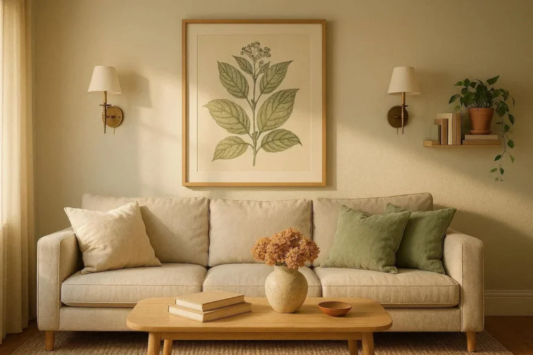
The fear of color in townhouses is understandable but often overcorrected. People paint everything white in the hope of maximizing light and space, then live in a home that feels cold and characterless.
The most effective approach is a warm neutral base with deliberate accent color. Warm whites – those with yellow, cream, or pink undertones – feel like light even when the room is dim. Cool whites with grey or blue undertones reveal themselves for what they are when natural light drops: just grey walls.
For narrow rooms specifically, the color should remain consistent across the walls and ceiling – eliminating the hard contrast between wall and ceiling makes the room feel taller and more cohesive. Using a slightly darker shade on the ceiling than the walls is a technique that works in rooms with higher-than-average ceilings (9 feet and up). In standard 8-foot rooms, keep the ceiling white or lighter than the walls.
Dark tones are not off-limits in townhouses – they’re just most effective in rooms where the goal is enclosure rather than expansion. A deep forest green or a rich navy in a small dining room or reading nook creates a jewel-box quality that feels intentional rather than cramped. The mistake is using dark colors in the hallway or stairwell, where light is already limited.
Accent colors that work well in narrow homes: terracotta, dusty sage, warm rust, and aged gold. These read as warm and grounding without advancing toward you the way saturated blues and greens can.
This is the section most blog posts gloss over, and it’s the most important one.
Layered lighting means three types of light working together in every room: ambient (the overall fill), task (focused on a surface or area), and accent (for atmosphere and emphasis). Most townhouses are set up with ambient lighting only – a ceiling rose with a pendant or a surface-mounted fitting. That single layer creates flat, shadowless light that makes rooms feel smaller and less interesting.
Warm bulbs are non-negotiable. The sweet spot is 2700–3000K. Below 2700K looks yellowed in brighter rooms; above 3000K reads as office lighting. For bedrooms and living areas, 2700K. For kitchens and bathrooms where task clarity matters, 3000K is acceptable. Replace any cool daylight bulbs (4000K and above) immediately – they are the single most common reason a townhouse feels sterile despite good furniture choices.
Wall sconces are more valuable than most people realize. They add light at eye level – which is where you want it for conversation and relaxation – rather than projecting it down from above. In a narrow hallway, a single wall sconce halfway down replaces the harsh spotlight of a ceiling fixture. In a bedroom, flanking the bed with sconces frees up bedside tables and adds warmth at exactly the right height.
Floor lamps are the most flexible tool. A brass arc lamp over an armchair costs less than a rewiring job and does more for the feel of the room than almost any piece of furniture. In a townhouse where corners can feel dead, a floor lamp with an uplight component throws light onto the ceiling and makes the room feel taller.
Avoid overhead-only lighting everywhere. A room with only a ceiling fixture and no lamps looks half-finished regardless of how much money went into the furniture.
The highest-ROI change in any townhouse is hardware. Replacing builder-grade brushed chrome door handles, cabinet pulls, and light switches with matte black or satin brass equivalents costs between £150–£400 for a whole house and transforms the quality feel of every room you walk through. This is the professional’s shortcut that most homeowners overlook.
Paint is the second-highest ROI investment. One wall painted in an intentional color – even a single accent wall or the inside of a bookcase – does more work than a room full of accessories.
For art on a budget: a consistent framing strategy makes inexpensive prints look expensive. Buy frames in one finish and one family of sizes. A £10 botanical print in a well-chosen matte black frame at the right scale reads as considered. The same print in a mismatched frame from a discount store reads as an afterthought.
DIY upgrades that work well in townhouses: replacing hollow-core internal doors with solid-core ones (dramatically reduces noise between floors), adding picture rail molding at door height to create a visual line of consistency, and installing dimmer switches on all circuits – the latter being one of the most transformative changes in a multi-level home.
For renters: removable wallpaper panels on one wall, large-format leaned mirrors, freestanding shelving that can travel with you, and furniture with legs (always easier to move, always makes a room feel larger) are all legitimate design choices that require no permanent alterations.
Blocking visual flow. In a narrow townhouse, anything that sits in the sightline from the front of the house to the back makes the space feel smaller. Keep the central corridor as clear as possible. Furniture should line the sides of rooms, not the center.
Oversized furniture. A three-seat sofa in a room that only has space for a two-seat plus armchair makes the room feel like a furniture showroom. Scale matters more than the absolute size of the room. Measure before you buy, every time.
Dark paint in the wrong places. Dark hallways and stairwells are suffocating in townhouses. Dark accent colors belong in rooms – dining rooms, bedrooms, reading nooks – not in circulation spaces.
Ignoring vertical space. Shelving that stops at eye level when the ceiling is eight feet high wastes the most powerful visual tool you have for making rooms feel deliberate rather than half-done. Go to the ceiling with shelving wherever possible, and use the upper sections for objects you display rather than things you need to reach daily.
Poor lighting. Already covered above, but it bears repeating: a townhouse decorated with thoughtful furniture and poor lighting will always look worse than a simply furnished townhouse with layered, warm lighting. Light is the environment. Get it right before everything else.
Focus on horizontal lines (wide-plank flooring, horizontal paneling), pull furniture away from walls by a few inches, use large-format mirrors on side walls rather than end walls, eliminate furniture that’s oversized for the room, and layer warm lighting throughout. The combination of these elements creates spatial expansion without structural change.
Warm neutrals as a base – linen white, aged bone, soft stone – with deliberate accent color in specific rooms. Warm-toned walls (those with yellow, cream, or blush undertones) hold their appeal as natural light changes throughout the day. Avoid cool greys and cool whites in narrow rooms; they read as cold and make limited natural light feel even more limited.
Establish a consistent material thread across floors – a shared metal finish, a repeated natural material like oak or linen, a consistent color family – rather than decorating each floor as a separate project. Light the staircase and landings properly so the vertical movement through the house feels connected rather than disconnected. Treat each landing as a purposeful space.
Choose furniture with exposed legs and slim profiles. Use a rug that’s correctly sized (front legs of all seating on the rug). Add a large mirror on a side wall. Mount a floating shelf behind the sofa rather than a freestanding cabinet. Layer lighting with a floor lamp and table lamp rather than relying on overhead alone. Edit aggressively – less furniture, placed well, is always better than more furniture filling the space.
Go vertical with shelving that runs to the ceiling. Use storage benches in the entryway and at the foot of beds. Choose media furniture that integrates closed storage. Use the space under stairs – often wasted – with bespoke shelving, a pull-out cabinet, or a built-in reading seat. In bedrooms, floor-to-ceiling wardrobes with flat-front doors painted to match the walls make storage invisible. The goal is storage that reads as architecture rather than furniture.
Townhouses aren’t difficult to style. They’re specific. They have a logic to them – vertical, linear, layered – and the homes that look genuinely good are the ones styled in alignment with that logic rather than against it.
The principles aren’t complicated: furniture sized correctly for narrow rooms, lighting layered at multiple heights with warm bulbs, a consistent material thread between floors, vertical space used deliberately, and color chosen with an understanding of how light moves through each level across a full day.
What makes the difference between a townhouse that feels like a compromise and one that feels like a considered, intentional home is discipline and intentionality. Discipline in editing – removing what shouldn’t be there. Intentionality in placement – understanding why each piece is where it is.
You don’t need more space. You need to use the space you have with more precision. That’s what good townhouse interior design comes down to, and it’s a skill worth investing in – because the results are genuinely impressive when it’s done right.