![]()
Bring Life to Your Living Space
![]()
Bring Life to Your Living Space

Empty walls can make even the most beautifully furnished room feel unfinished. A gallery wall is one of the easiest and most personal ways to add character, warmth, and style to any space. Whether you love clean, coordinated layouts or a relaxed, eclectic mix, there is a gallery wall idea that works for you.
The tricky part? Arranging frames on a wall without it looking messy or random. Many people hang a few pieces and then step back to realize something feels off. This guide walks you through 17 fresh gallery wall ideas, practical layout tips, and common mistakes to skip so you can design a display that looks intentional and beautiful every time.
Classic gallery wall styles work in almost every home. They rely on order, balance, and clean lines to create a polished look that stands the test of time. If you love a neat, put-together aesthetic, start here.
A symmetrical layout uses matching or mirrored frames placed in equal rows and columns. This style feels formal and intentional, which works beautifully in dining rooms, entryways, and above a sofa.
Layout tip: Choose frames in the same size and color. Lay them on the floor first and measure the total width before touching a nail. Equal spacing of 2 to 3 inches between frames keeps it looking crisp.
Budget tip: Matching frames from a dollar store or discount home store work perfectly here since the uniformity is the whole point.
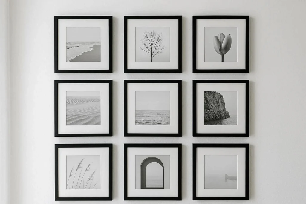
A grid layout takes the symmetrical approach a step further. Think four frames in a two-by-two arrangement, or six frames in a two-by-three grid. It is clean, modern, and works especially well with black-and-white photography.
Layout tip: Cut paper templates to the size of each frame and tape them to the wall before you hang anything. This makes repositioning easy and saves you from extra nail holes.
This classic picture wall idea involves lining up frames of varied sizes while keeping the spacing between each one exactly the same. The consistent gap creates a sense of rhythm and order even when the frames and art differ.
Layout tip: Use a level and a measuring tape. Start from the center of the wall and work outward to keep the arrangement balanced on both sides.
Not every gallery wall needs to follow the rules. Creative layouts give you the freedom to mix, layer, and experiment. These ideas work well for people who love a curated but relaxed look, and they tend to feel more personal and unique than perfectly matched sets.
An asymmetrical layout uses different frame sizes, shapes, and spacing arranged in a way that feels balanced without being perfectly even. One large frame on the left can be balanced by three smaller ones stacked on the right.
Layout tip: Anchor the layout with one large piece, then build outward. Stand back frequently and look at the wall as a whole rather than focusing on individual frames.
Who says every frame has to match? Combining wooden frames, metallic ones, thin black lines, and ornate gold edges creates depth and personality. This style suits bohemian, eclectic, and vintage-inspired interiors particularly well.
Layout tip: Pick one unifying element to tie the frames together. It could be the same mat color, the same art style, or a consistent color palette across the artwork.
Layering means placing frames in front of or slightly overlapping decorative shelves, plants, mirrors, or other objects. This adds dimension and turns the gallery wall into a real design moment.
Layout tip: Keep the heavier frames and objects lower and add lighter pieces like small prints or hanging plants higher up. This creates a natural visual weight balance.
A salon-style display fills an entire wall from floor to near-ceiling with frames of all shapes and sizes. It is maximalist, bold, and full of personality. Think old European art galleries.
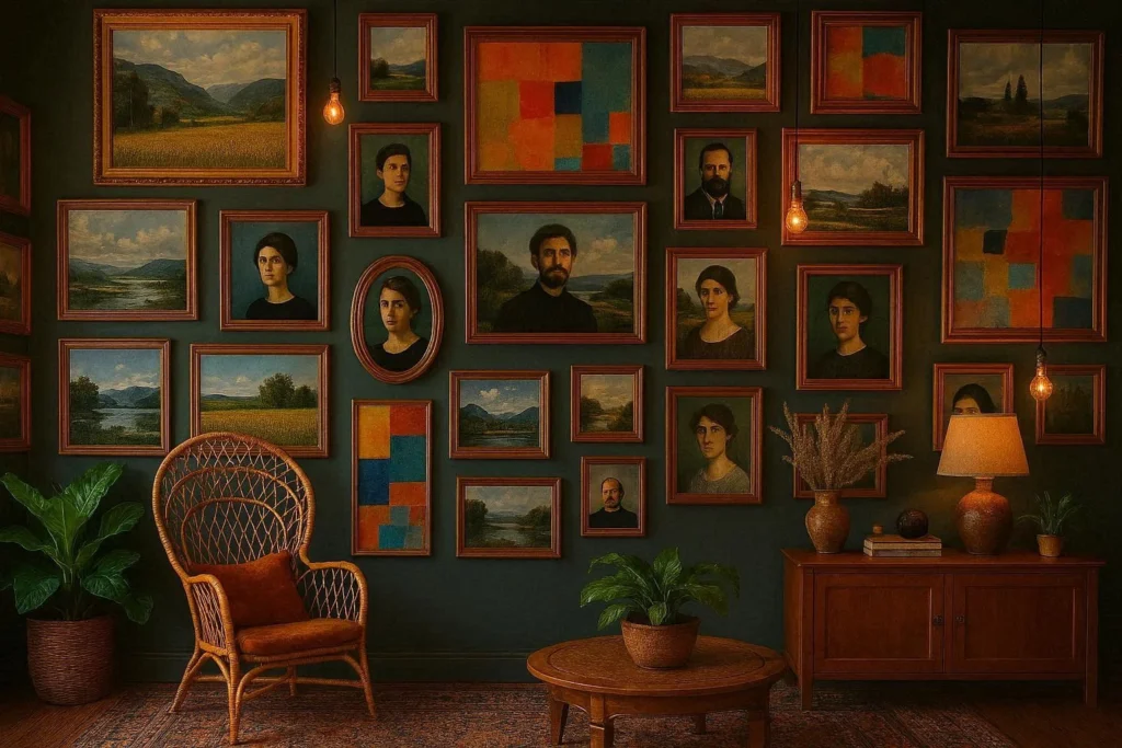
Layout tip: Start at the center of the wall at eye level and work outward and upward. The goal is a full, abundant look, so do not be shy about adding more pieces as you go.
For more wall decor ideas, exploring different combinations of art and objects can inspire an arrangement you truly love.
The best gallery wall layout depends a lot on where it will live. A bedroom wall calls for something calming, while a hallway benefits from a bold, attention-grabbing display. Here are ideas tailored to specific rooms.
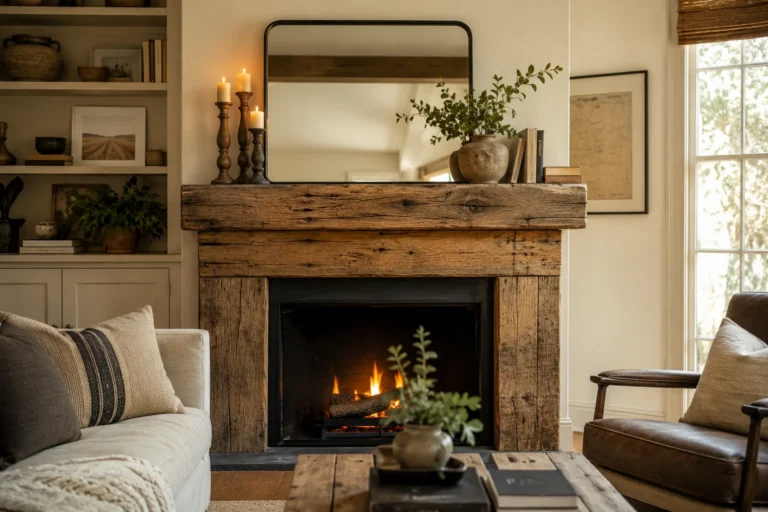
The living room is the most popular spot for a gallery wall, and for good reason. It is where you spend the most time and where guests are most likely to admire your style. A large wall behind the sofa is the classic choice.
Layout tip: Keep the bottom frame at least 8 to 10 inches above the sofa cushions. The gallery wall should feel connected to the furniture, not floating high above it.
Budget tip: Print your own digital art or family photos in large format at a local print shop for a fraction of the cost of buying original artwork.
For more living room wall decor ideas, pairing your gallery wall with complementary furniture and lighting makes a big difference.
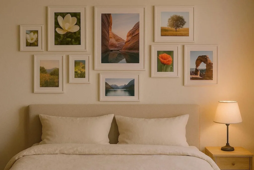
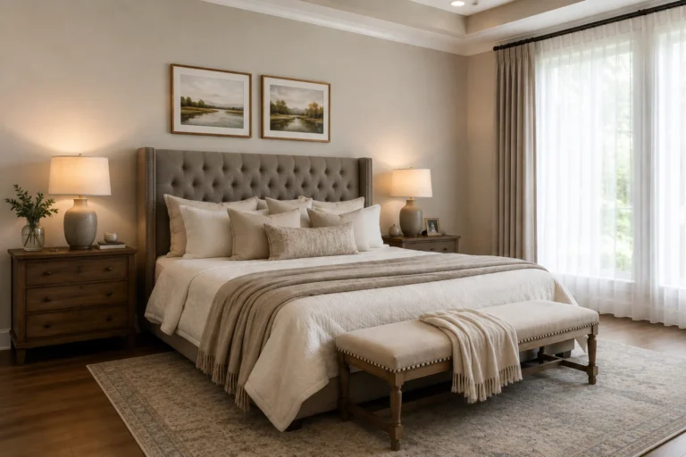
Bedroom gallery walls benefit from a calm, cohesive feel. Soft tones, dreamy photographs, and simple line art work well here. A wall above the bed or headboard is the most common placement.
Layout tip: Keep the overall width of the gallery wall similar to the width of the bed or headboard. A spread that is too narrow or too wide will look mismatched with the furniture below.
A staircase gallery wall follows the angle of the stairs, rising diagonally along the wall as you climb. It is a creative way to fill an awkward, tall space that often gets ignored.
Layout tip: Follow the angle of the staircase with the top or center line of your frames rather than keeping them level. This diagonal flow feels intentional and designed rather than accidental.
Small rooms or narrow hallways can still host a gallery wall. The trick is to scale down the frames and keep the arrangement tight and compact. Even three or four small frames grouped together create impact.
Layout tip: Choose lighter-colored frames and matte finishes in small spaces. Dark, bulky frames can overwhelm a small wall and make the room feel cramped.
For more small living room decor ideas that work in tight spaces, think vertically and use wall-mounted elements to keep the floor clear.
Some of the most meaningful gallery walls are the ones filled with personal memories. Photos, handmade art, collected pieces, and travel mementos make a wall feel like it truly belongs to the people who live there.
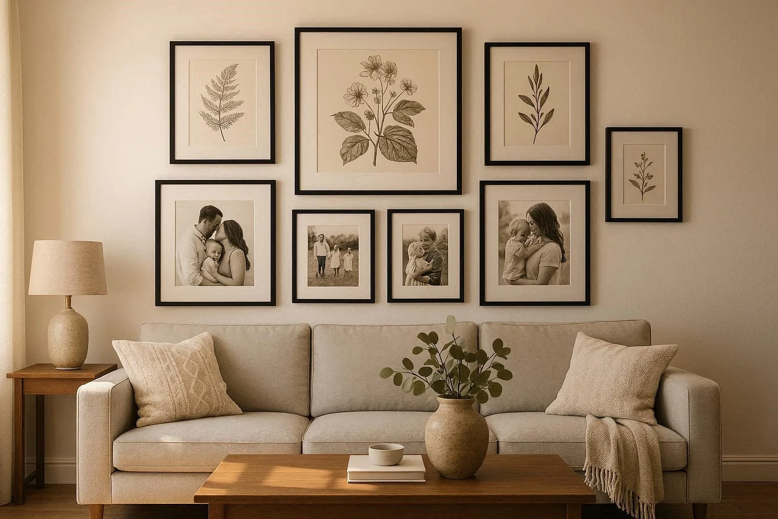
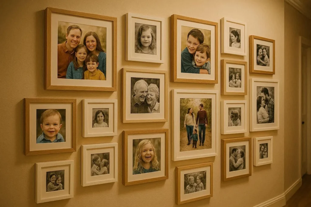
A dedicated family photo wall is a timeless classic. Black-and-white prints create a cohesive, elegant look even when the photos span different eras and styles. Color photos work too when you keep the frames consistent.
Layout tip: Mix portrait and landscape orientations to keep the arrangement dynamic. A row of all horizontal or all vertical frames can start to feel monotonous.
A travel memory wall gathers photographs, postcards, maps, and small mementos from places you have visited. It tells a story and sparks conversation every time someone walks by.
Layout tip: Vary the objects. Mix framed prints with small shadowboxes, pinned postcards, and even a small world map marked with your destinations. The variety is part of the charm.
Turn your children’s drawings and paintings into a rotating gallery. Use simple clip frames or art rails that allow you to swap pieces in and out without new nail holes.
Layout tip: Hang the gallery at a height your children can see and appreciate. This makes them feel proud of their work and gives the wall an extra layer of meaning.
Mixing original artwork with personal photographs is a sophisticated way to build a gallery wall that feels curated rather than purely sentimental. Alternate between art prints, framed quotes, and photographs to create rhythm and interest.
Layout tip: Use a neutral mat on every piece, even if the frames vary. A consistent white or cream mat acts as a visual equalizer that ties different styles together beautifully.
A monochrome photo wall keeps all images in black and white and all frames in the same color, usually black, white, or natural wood. The result is graphic, modern, and works in virtually any decor style.
Layout tip: Choose images with strong composition and contrast. Soft, washed-out images can lose impact when converted to black and white, so look for photos with clear light and shadow.
Botanical prints, nature photography, and pressed plant illustrations bring a calm, organic feel to any room. This style suits living rooms, bathrooms, and home offices particularly well. For inspiration on combining nature-inspired elements with creative home decor ideas, think beyond frames to include small potted plants or hanging greenery alongside your prints.
Layout tip: Stick to a similar color palette across all the prints, earthy greens, warm neutrals, and soft whites, to keep the look cohesive even when the plant species vary.
One of the most common mistakes people make is starting at the wall right away. Taking a few extra minutes to plan on the floor saves a lot of frustration later.
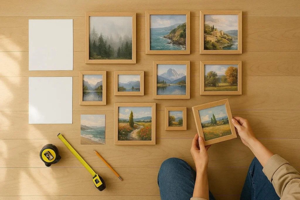
Step 1: Gather your pieces. Collect everything you want to include, frames, artwork, mirrors, and any decorative objects.
Step 2: Lay it out on the floor. Arrange all the pieces on the floor in front of the wall you plan to use. This lets you experiment with layouts without commitment.
Step 3: Trace and cut paper templates. Trace each frame onto paper and cut it out. Label the back of each template with the name or description of the piece.
Step 4: Tape the templates to the wall. Use painter’s tape to attach the paper templates in your chosen arrangement. Stand back and adjust until it looks right.
Step 5: Start from the center. Begin hanging from the center of the arrangement and work outward. This keeps the layout balanced and prevents the finished display from looking lopsided.
Step 6: Use a level. Even a slight tilt is noticeable once the frame is up. A small level or the level tool on your phone takes the guesswork out.
Getting the spacing right is one of those details that separates a gallery wall that looks designed from one that looks random. In fact, spacing and alignment often matter more than the frames themselves. Uneven gaps between pieces are usually the first thing the eye notices, even before it registers what the artwork actually is.
Ideal gap between frames: Aim for 2 to 3 inches between frames for a tighter, more curated look. Up to 4 to 5 inches works well for a more relaxed, airy arrangement. Stay consistent with your chosen gap throughout the display.
Choosing the right frame size: Include at least one frame that is noticeably larger than the rest. This creates a focal point and prevents every piece from competing equally for attention.
Balance and proportion: A good rule of thumb is to fill roughly 60 to 75 percent of the wall space. Leaving some breathing room around the edges of the arrangement prevents the display from feeling overwhelming.
Eye level rule: The center of your gallery wall should sit at approximately 57 to 60 inches from the floor, which is the standard museum hanging height and also the average human eye level.
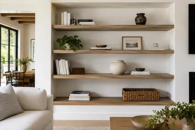
For walls with very large empty space, consider extending the gallery wall with larger statement pieces. Large wall decor ideas often combine gallery walls with other elements like architectural panels, mirrors, or floating shelves to fill the space without overcrowding it.
Even great pieces can look disappointing if the arrangement has common pitfalls. Here are the ones worth knowing before you start.
Uneven spacing: This is the most common issue. Use a ruler or measuring tape to keep the gaps between frames consistent. Random spacing makes the wall feel accidental rather than designed.
Too many different styles: Mixing rustic wood frames with sleek black metal frames and ornate gold baroque frames in the same display rarely works well. Pick two or at most three frame styles and stick with them.
No focal point: Every great gallery wall has one piece that draws the eye in first. Without an anchor, the arrangement feels like a collection of random objects rather than a composed display.
Hanging too high: Frames that are placed too high on the wall look disconnected from the furniture below. Keep artwork in conversation with the room, not floating near the ceiling.
Ignoring the wall color: Light artwork on a white wall can disappear. Dark artwork on a very dark wall can feel heavy. Think about how your art choices interact with the wall color behind them.
Starting with too few pieces: Gallery walls often need more pieces than you expect. If in doubt, add one more. A sparse arrangement tends to look like you ran out of ideas rather than made a deliberate choice.
Start by laying everything out on the floor to experiment with different layouts. Once you are happy with the arrangement, trace each frame onto paper, cut out the templates, and tape them to the wall. Hang from the center outward and use a level for each piece.
For a tight, polished look, use 2 to 3 inches between frames. For a more relaxed arrangement, 4 to 5 inches works well. The most important thing is to keep the spacing consistent throughout the display.
Yes, but with some intention behind it. Limit yourself to two or three different frame styles and find one unifying element across the display, such as a consistent mat color or artwork palette, to keep it looking cohesive rather than chaotic.
Use printable digital art, print your own photos at a local print shop, or repurpose thrift store frames with a coat of matching spray paint. Consistent, matching frames from a budget home store can look just as polished as expensive ones.
A good starting point is to aim for a display that is roughly the same width as the furniture below it, such as a sofa or a bed. Fill about 60 to 75 percent of the available wall space and leave breathing room around the edges.
A gallery wall is one of the most personal and rewarding things you can add to your home. It takes a bare wall and turns it into something that tells your story, reflects your taste, and makes the room feel complete.
The secret is not having the most expensive frames or the most prestigious art. It is about thoughtful arrangement, consistent spacing, and a clear sense of what you love. Start with a plan, take it one piece at a time, and do not be afraid to rearrange until it feels right.
Your home deserves walls that mean something. Now you have everything you need to make them beautiful.